45 Impressive Typography Designs

If you read blog from time to time you know that I am a fan of typography.  As I was perusing the web today I came across this list of typography design, inspirational in nature.

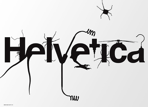
Actually it was the above image from Popular Mechanics that caught my eye.   It’s a magazine my father subscribes to, and I remember reading that exact issue last time I was visiting at home.   So I had to click on the link of course.   The list is courtesy of InspirationFeed.com (@Inspirationf)

Take a look for yourself.
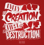
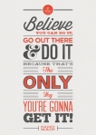
45 Remarkable Examples Of Typography Design #9 | inspirationfeed.com.

Political Design Work – Appropriate a Day Before the Election Don’t You Think?

Being the day before the big election I found it fitting to share some political work of my own.   It’s not on the national stage mind you, but of a local race here in Indiana for State Representative.   The gentleman running for office I’ve known for over a decade since our days back in the fraternity house.  When he approached me back in early February to lend my services I was more than happy to help.

So check out some political work done by LeFors Design. Trust me when I say its not your typical campaign material. Design elements range from social media to traditional print material.  I’ve provided the link to the whole album below.

LeFors Design: Political Campaign Design

Social Media History via One Giant Infographic

Who wants to simply read something when it can be presented in a much more visual fashion.   I believe we are becoming an increasingly visual culture, relying on the image more than the text to convey a message.   However, I also believe the happy medium between the two forms of communication is the infographic.

To prove my point, take a look at this infographic from Brand Flakes (@brandflakesblog).  It’s a visual representation of the history of our social media world from 1971 to today…yes it goes back that far.  The topic is presented in a way that is visually pleasing while still very informative.

What do you think?

brandflakesforbreakfast: social media history in one giant info-graphic.

Design Resume – More than a Word Doc


Back in 2007, a couple years after graduating college, and before I ventured into the world of design all on my own, I would scour the internet and job boards for hours on end looking for work.   What is the one item every potential employee is supposed to have…the all encompassing “get to know me in one page before ever meeting me” resume.

My resume was a Word doc masterpiece.  After 7,000 revisions and edits…or so it felt like…every well crafted word I beleived represented my best qualities to a total stranger that I often times would never meet.  But being a designer, I came to learn that I needed more that a piece of paper to “stand out”.  My resume had to be much more visual.

That’s why I found this resume from fellow designer, Ashley Spencer, so very interesting.   Her “Info-Graphic Map of Me” is a great take on the tired resume.

The question is, would it make you as employer take notice or just toss it aside.   Take a look and decide for yourself.

Curriculum Vitae / Resume on Behance.

Enjoy!

Lineposters: Subway Maps of Cities Around The World

Check out these works of art created by graphic artist Cayla Ferari and engineer John Breznicky.  What started out as a clever way to jazz up the walls of their NY apartment turned into a full fledged entrepreneurial endeavor.

The first version was a minimalist take of the NY subway system.  Today Lineposters.com has versions representing transit systems from all over the world.

Check em out.  I’m tempted to buy a few myself.  If only Indianapolis had a  transit system worth emulating in poster form.  Aw shucks.

Thanks to the Huffington Post for first tweeting this story.  Can I send you the bill for the money I’m going to spend on this art, because of reading you tweet 🙂

Movie Posters: A modern take on cinema classics

Who can forget the days when posters were the decoration of choice for your bedroom walls.  For me, especially in college at least, my rooms were covered in poster prints.  A Swingers print here, a Pulp Fiction print, there…although I never donned a Scarface print. However, the days of buying cheap movie poster prints are long gone

…or so I thought.

My interest in movie prints has grown substantially over the past few weeks upon the discovery of some movie poster remakes.   These new posters are very eye catching and are a welcome change to the mass produced cheap versions of days past.

These new creations have minimal design elements, yet succeed in clearly identifying the movie.  My hope is that this type of artistic design will catch on, replacing the tired and overproduced versions we see today.  Take a look at some samples below from two artists.

The first works collection of work is from an artist that goes by Brick Hut.
brickhut.wordpress.com

The second collection is from a group called Moxy Creative.  These are available for purchase on their site moxycreative.com/dressthepart.  Credit also goes to James Alexander Mathers and Andrew Lau