Costumes, Casinos, and a Cause – “Photo Booth” @ Raising the Stakes for Noble of Indiana

Fundraising events are necessary for any philanthropic/non profit organization.   The more engaging the event, the better.   Last week I was asked to provide my photography skills for Noble of Indiana, and organization that “creates opportunities and provides learning disability services for the developmentally disabled to live meaningful lives in Indiana.”

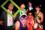
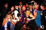
“Raising the Stakes” is an annual event with a casino feel filled with a variety of staple casino games, and also includes a classy dinner and multiple raffles/auctions.   This year they added a “Photo Booth” where people could let loose and wear a variety of ridiculous costume items.   My job was to snap the photos, of course.

I’ve done the “Photo Booth” at several events around Indianapolis and I am continually surprised at how excited people get to pose for these pictures.   It’s a great addition to any event, raising the energy level and enthusiasm of everyone present.

I’ve provided a link  to the pictures on my Facebook business page below.  Take a quick look…I’m sure you’ll have a couple laughs.  Congrats to Noble of Indiana on a successful event.

“Photo Booth” @ Raising the Stakes for Noble of Indiana

45 Impressive Typography Designs

If you read blog from time to time you know that I am a fan of typography.  As I was perusing the web today I came across this list of typography design, inspirational in nature.

Actually it was the above image from Popular Mechanics that caught my eye.   It’s a magazine my father subscribes to, and I remember reading that exact issue last time I was visiting at home.   So I had to click on the link of course.   The list is courtesy of InspirationFeed.com (@Inspirationf)

Take a look for yourself.
45 Remarkable Examples Of Typography Design #9 | inspirationfeed.com.

Political Design Work – Appropriate a Day Before the Election Don’t You Think?

Being the day before the big election I found it fitting to share some political work of my own.   It’s not on the national stage mind you, but of a local race here in Indiana for State Representative.   The gentleman running for office I’ve known for over a decade since our days back in the fraternity house.  When he approached me back in early February to lend my services I was more than happy to help.

So check out some political work done by LeFors Design. Trust me when I say its not your typical campaign material. Design elements range from social media to traditional print material.  I’ve provided the link to the whole album below.

LeFors Design: Political Campaign Design

I’d Like to Buy a Vowel…My Wheel of Fortune Adventure (As Seen on IndySphere.com)

That’s right.  I was on Wheel of Fortune.  I could go into great detail here, but I’d rather share the story I wrote for my fellow entrepreneur friends over at  IndySphere….where they are “Curating All Things Indy”.   I originally provided design assistance with their logo design back in early 2012 and now I’ve been invited to be a featured writer for their site.

My first story?  My roller coaster Wheel of Fortune experience.   Enjoy the read!

I’d Like to Buy a Vowel…My Wheel of Fortune Adventure.

Social Media History via One Giant Infographic

Who wants to simply read something when it can be presented in a much more visual fashion.   I believe we are becoming an increasingly visual culture, relying on the image more than the text to convey a message.   However, I also believe the happy medium between the two forms of communication is the infographic.

To prove my point, take a look at this infographic from Brand Flakes (@brandflakesblog).  It’s a visual representation of the history of our social media world from 1971 to today…yes it goes back that far.  The topic is presented in a way that is visually pleasing while still very informative.

What do you think?

brandflakesforbreakfast: social media history in one giant info-graphic.

Design Resume – More than a Word Doc


Back in 2007, a couple years after graduating college, and before I ventured into the world of design all on my own, I would scour the internet and job boards for hours on end looking for work.   What is the one item every potential employee is supposed to have…the all encompassing “get to know me in one page before ever meeting me” resume.

My resume was a Word doc masterpiece.  After 7,000 revisions and edits…or so it felt like…every well crafted word I beleived represented my best qualities to a total stranger that I often times would never meet.  But being a designer, I came to learn that I needed more that a piece of paper to “stand out”.  My resume had to be much more visual.

That’s why I found this resume from fellow designer, Ashley Spencer, so very interesting.   Her “Info-Graphic Map of Me” is a great take on the tired resume.

The question is, would it make you as employer take notice or just toss it aside.   Take a look and decide for yourself.

Curriculum Vitae / Resume on Behance.

Enjoy!

75 Top Typography Tutorials

Usually “top” lists are in the 5, 10, or maybe 20 range…but 75?  That’s rare.

I rely heavily on fonts when creating a piece.  As I continue to learn and grow in this industry, and in working with my various clients, I’ve come to appreciate Typography as one of the most effective design tools at my disposal.

So much messaging can be represented by just a few well crafted/designed words.

I encourage you to look through this list of the “75 Top Typography Tutorials” from Creative Bloq (@CreativeBloq).  I bet you’ll find it as useful as I have.

Enjoy!

75 top typography tutorials | Creative Bloq.

20 Tips to Overcome that Creative Block

A post like this seems appropriate for anyone with a case of the Mondays.   We’ve all been there before, the seemingly impossible task to get the creative juices flowing.

Take a look at these 20 tips and perhaps there’s one listed that may do the trick for you.

How to overcome creative block: 20 brilliant tips | Creative Bloq.

Designing for Print in a Social Media World

Everyone is using social media…it’s a staple for any start up especially.  So much of what I do for clients lives online…Facebook, Twitter, eBlasts, Web banners. Ads….not to mention gB after gB of photos.

Even with all the digital work out there, people still need to print things.  From the conversations I have with clients, a misconception is taking shape…that designing images for print is the same as designing images for the web.

Don’t get me wrong, designing imagery for the web is no simple task.  Dimensions, formats, pixels, file size, images matching across multiple platforms, …it can be a challenge.  But designing for print carries it’s own challenges and risks.  If you aren’t careful you can end up costing you and your client a lot of time and money…not to mention resources.  (You can Ctrl + Z a mistake of a digital design with relative ease….but Ctrl + Z a mistake after a print run of 10,000 pieces is a little tougher)

That’s why I found this write up from Creative Bloq (@CreativeBloq) so helpful…and yes I do mess up from time to time.

“10 questions you should always ask your printer” is a helpful guide to keep even the most experienced designers from making a rookie mistake when working with a print house.

Print media and Social Media aren’t going anywhere, anytime soon.  It’s important as designers that we stay sharp on the fundamentals for both.

10 questions you should always ask your printer | Creative Bloq.